Back in May I wrote a blog about ‘xG added’, a metric that measures the value of passes (and dribbles). Basically it assigns a ‘danger’ value to the start and end location of an action. The difference between both values is the ‘xG added’ by the player performing the action. If you want to read a more elaborate explanation, please check this blog.
Lately I’ve been making some improvements to the model, of which I posted the first two parts a few weeks ago:
Previously I’ve posted top 10 rankings in xG added, for instance like this one:
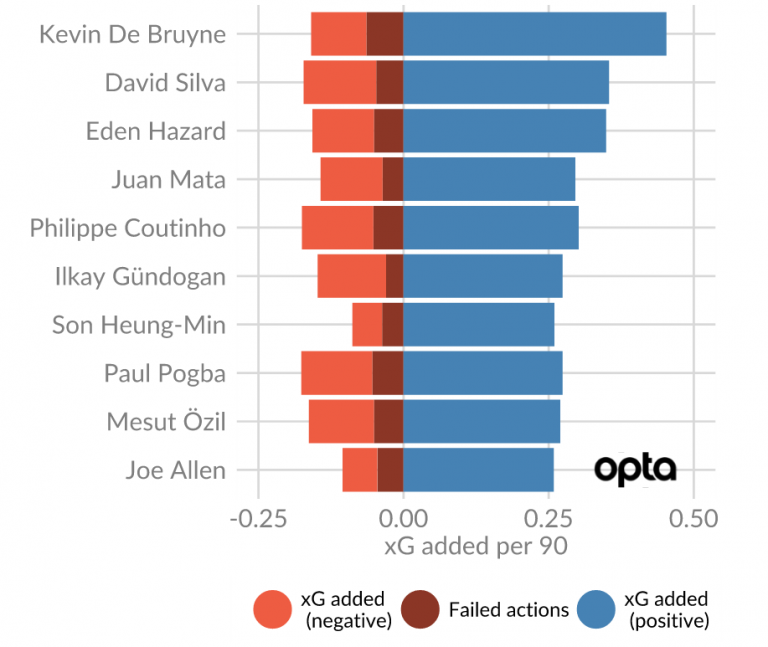
Some people noted that these rankings tend to be very attacker/attacking midfielder dominated. Aren’t there any defenders good at progressing the ball? Well of course there are, but due to their position on the field it’s harder for them to pass into dangerous locations. This becomes very clear when you see where these dangerous locations are on the pitch:
In the above picture, the whiter, the more dangerous. For a defender, no matter how good at passing he is, it’s going to be very difficult to pass into these dangerous locations and thus gain xG added. On the other hand, an attacker is always close to this ‘danger zone’, and thus has more opportunities to gain xG added.
As @GoalImpact noted, it therefore might be useful to correct for this difference in playing position. As a start, let’s first have a look at which locations usually cater good ball progression. We can do this by looking at the average xG added for actions from a certain location.
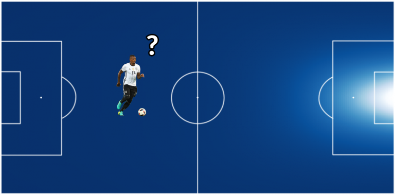
For instance, in the above picture, Jérôme Boateng has the ball on his own half. On average, what would be the xG added we would expect see for an action from this position? If we do this for all locations on the field, we get the following picture:
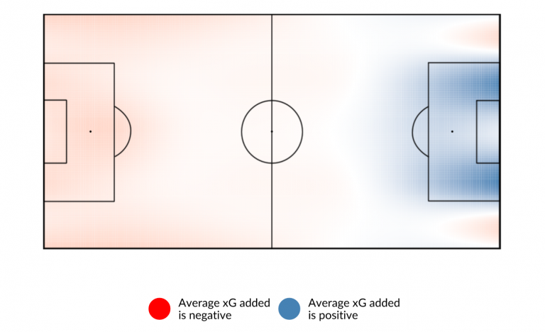
As expected, locations closer to the opponents goal are usually locations where actions yield a higher xG added. However, there are a few more interesting things to see here:
Right in front of goal, the average xG added for an action is pretty low. If a player has the ball at such a location, it will be very hard to improve the location any further. Not a lot of actions take place in this location, and if they do they will have a low xG added.
The areas around all have high xG added. These locations are significantly less dangerous than the spot right in front of goal, but are very close to it and thus make it easy to pass to more dangerous positions.
The most interesting thing however to me, is that it looks like the ‘half spaces’ are the best places to pass from. Half-spaces are certain areas of the field, often used in tactical analysis.
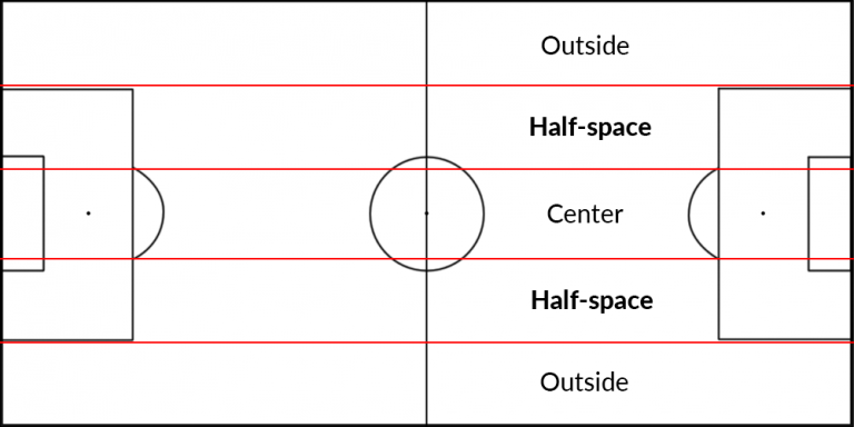
They are usually described as good locations, due to the fact that they give a player a lot of passing directions, and due to the fact that they are usually less crowded than the center. If you want to read more about half-spaces, read this excellent piece by Spielverlagerung.
As it turns out, these locations also seem to be the best locations to pass from when looking at xG added. This is not a big surprise, but it’s nice to see a generally accepted theory back in the data. In/around the opposition box, it turns out an action from a location in the half-spaces yields a higher xG added on average than one from the center/side.
Furthermore, in the defensive half and all the way in the offensive corner area, the touch lines should be avoided. xG added from actions close to the side line is lower on average, probably because it’s easier to shield off passing options or to press players that attempt actions from those locations. This again is in line with the tactical idea behind half-spaces.
Influence on players
Now that we know which locations generally result in good xG added scores, we can calculate if players are getting more or less xG added than expected, compared to their action locations. This gives the following picture for the current Premier League season, for players who played more than 500 minutes:
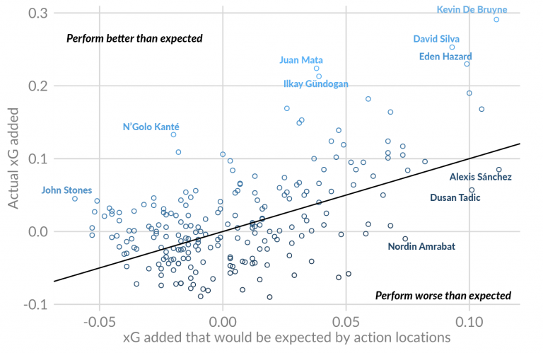
The black line represents the line where the expected xG added is equal to the actual xG added. That means that players far above the line are performing better than expected, whereas players below the line are performing worse than expected.
NOTE: This metric only measures ball progression skill. Therefore players who tend to be more concentrated on goal scoring don’t necessarily show up in a positive way. This doesn’t mean they’re not good, just that they don’t excel in this metric.
Whether this over/underperformance is due to skill or luck remains to be seen. It’s very much possible that the a large part of the skill measured with xG added is getting into good positions repeatedly, just like with normal xG. It must also be noted that the sample size is relatively small, as all players played a maximum of 10 games.
It’s definitely interesting though that players in deeper position like Kanté and Stones pop-up using this method, even though their positions make it harder for them to perform well in xG added. It might be a method to look for good passers in more defensive roles. For instance, Claudio Bravo tops the goalkeepers by a mile, which feels right.
That’s all for now. Thanks for reading. As usual, if you have any feedback/questions feel free to contact me on Twitter at @NilsMackay. If you want to get into contact you can also send an e-mail to mackayanalytics@gmail.com